


This HTML version of "Think Stats 2e" is provided for convenience, but it is not the best format for the book. In particular, some of the math symbols are not rendered correctly.
You might prefer to read the PDF version, or you can buy a hard copy from Amazon.
Chapter 2 Distributions
2.1 Histograms
One of the best ways to describe a variable is to report the values that appear in the dataset and how many times each value appears. This description is called the distribution of the variable.
The most common representation of a distribution is a histogram, which is a graph that shows the frequency of each value. In this context, “frequency” means the number of times the value appears.
In Python, an efficient way to compute frequencies is with a
dictionary. Given a sequence of values, t:
hist = {}
for x in t:
    hist[x] = hist.get(x, 0) + 1
The result is a dictionary that maps from values to frequencies.
Alternatively, you could use the Counter class defined in the
collections module:
from collections import Counter
counter = Counter(t)
The result is a Counter object, which is a subclass of
dictionary.
Another option is to use the pandas method value_counts, which
we saw in the previous chapter. But for this book I created a class,
Hist, that represents histograms and provides the methods
that operate on them.
2.2 Representing histograms
The Hist constructor can take a sequence, dictionary, pandas Series, or another Hist. You can instantiate a Hist object like this:
>>> import thinkstats2
>>> hist = thinkstats2.Hist([1, 2, 2, 3, 5])
>>> hist
Hist({1: 1, 2: 2, 3: 1, 5: 1})
Hist objects provide Freq, which takes a value and
returns its frequency:
>>> hist.Freq(2)
2
The bracket operator does the same thing:
>>> hist[2]
2
If you look up a value that has never appeared, the frequency is 0.
>>> hist.Freq(4)
0
Values returns an unsorted list of the values in the Hist:
>>> hist.Values()
[1, 5, 3, 2]
To loop through the values in order, you can use the built-in function
sorted:
for val in sorted(hist.Values()):
    print(val, hist.Freq(val))
Or you can use Items to iterate through
value-frequency pairs:
for val, freq in hist.Items():
     print(val, freq)
2.3 Plotting histograms
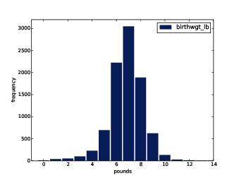
Figure 2.1: Histogram of the pound part of birth weight.
For this book I wrote a module called thinkplot.py that provides
functions for plotting Hists and other objects defined in
thinkstats2.py. It is based on pyplot, which is part of the
matplotlib package. See Section ?? for information
about installing matplotlib.
To plot hist with thinkplot, try this:
>>> import thinkplot
>>> thinkplot.Hist(hist)
>>> thinkplot.Show(xlabel='value', ylabel='frequency')
You can read the documentation for thinkplot at
http://greenteapress.com/thinkstats2/thinkplot.html.
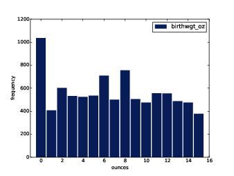
Figure 2.2: Histogram of the ounce part of birth weight.
2.4 NSFG variables
Now let’s get back to the data from the NSFG. The code in this
chapter is in first.py.
For information about downloading and
working with this code, see Section ??.
When you start working with a new dataset, I suggest you explore the variables you are planning to use one at a time, and a good way to start is by looking at histograms.
In Section ?? we transformed agepreg
from centiyears to years, and combined birthwgt_lb and
birthwgt_oz into a single quantity, totalwgt_lb.
In this section I use these variables to demonstrate some
features of histograms.
Figure 2.3: Histogram of mother’s age at end of pregnancy.

I’ll start by reading the data and selecting records for live births:
    preg = nsfg.ReadFemPreg()
    live = preg[preg.outcome == 1]
The expression in brackets is a boolean Series that
selects rows from the DataFrame and returns a new DataFrame.
Next I generate and plot the histogram of
birthwgt_lb for live births.
    hist = thinkstats2.Hist(live.birthwgt_lb, label='birthwgt_lb')
    thinkplot.Hist(hist)
    thinkplot.Show(xlabel='pounds', ylabel='frequency')
When the argument passed to Hist is a pandas Series, any
nan values are dropped. label is a string that appears
in the legend when the Hist is plotted.
Figure 2.4: Histogram of pregnancy length in weeks.

Figure ?? shows the result. The most common value, called the mode, is 7 pounds. The distribution is approximately bell-shaped, which is the shape of the normal distribution, also called a Gaussian distribution. But unlike a true normal distribution, this distribution is asymmetric; it has a tail that extends farther to the left than to the right.
Figure ?? shows the histogram of
birthwgt_oz, which is the ounces part of birth weight. In
theory we expect this distribution to be uniform; that is, all
values should have the same frequency. In fact, 0 is more common than
the other values, and 1 and 15 are less common, probably because
respondents round off birth weights that are close to an integer
value.
Figure ?? shows the histogram of agepreg,
the mother’s age at the end of pregnancy. The mode is 21 years. The
distribution is very roughly bell-shaped, but in this case the tail
extends farther to the right than left; most mothers are in
their 20s, fewer in their 30s.
Figure ?? shows the histogram of
prglngth, the length of the pregnancy in weeks. By far the
most common value is 39 weeks. The left tail is longer than the
right; early babies are common, but pregnancies seldom go past 43
weeks, and doctors often intervene if they do.
2.5 Outliers
Looking at histograms, it is easy to identify the most common values and the shape of the distribution, but rare values are not always visible.
Before going on, it is a good idea to check for outliers, which are extreme values that might be errors in measurement and recording, or might be accurate reports of rare events.
Hist provides methods Largest and Smallest, which take
an integer n and return the n largest or smallest
values from the histogram:
    for weeks, freq in hist.Smallest(10):
        print(weeks, freq)
In the list of pregnancy lengths for live births, the 10 lowest values
are [0, 4, 9, 13, 17, 18, 19, 20, 21, 22]. Values below 10 weeks
are certainly errors; the most likely explanation is that the outcome
was not coded correctly. Values higher than 30 weeks are probably
legitimate. Between 10 and 30 weeks, it is hard to be sure; some
values are probably errors, but some represent premature babies.
On the other end of the range, the highest values are:
weeks  count
43     148
44     46
45     10
46     1
47     1
48     7
50     2
Most doctors recommend induced labor if a pregnancy exceeds 42 weeks, so some of the longer values are surprising. In particular, 50 weeks seems medically unlikely.
The best way to handle outliers depends on “domain knowledge”; that is, information about where the data come from and what they mean. And it depends on what analysis you are planning to perform.
In this example, the motivating question is whether first babies tend to be early (or late). When people ask this question, they are usually interested in full-term pregnancies, so for this analysis I will focus on pregnancies longer than 27 weeks.
2.6 First babies
Now we can compare the distribution of pregnancy lengths for first
babies and others. I divided the DataFrame of live births using
birthord, and computed their histograms:
    firsts = live[live.birthord == 1]
    others = live[live.birthord != 1]

    first_hist = thinkstats2.Hist(firsts.prglngth, label='first')
    other_hist = thinkstats2.Hist(others.prglngth, label='other')
Then I plotted their histograms on the same axis:
    width = 0.45
    thinkplot.PrePlot(2)
    thinkplot.Hist(first_hist, align='right', width=width)
    thinkplot.Hist(other_hist, align='left', width=width)
    thinkplot.Show(xlabel='weeks', ylabel='frequency',
                   xlim=[27, 46])
thinkplot.PrePlot takes the number of histograms
we are planning to plot; it uses this information to choose
an appropriate collection of colors.
Figure 2.5: Histogram of pregnancy lengths.
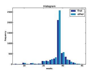
thinkplot.Hist normally uses align='center' so that
each bar is centered over its value. For this figure, I use
align='right' and align='left' to place
corresponding bars on either side of the value.
With width=0.45, the total width of the two bars is 0.9,
leaving some space between each pair.
Finally, I adjust the axis to show only data between 27 and 46 weeks. Figure ?? shows the result.
Histograms are useful because they make the most frequent values immediately apparent. But they are not the best choice for comparing two distributions. In this example, there are fewer “first babies” than “others,” so some of the apparent differences in the histograms are due to sample sizes. In the next chapter we address this problem using probability mass functions.
2.7 Summarizing distributions
A histogram is a complete description of the distribution of a sample; that is, given a histogram, we could reconstruct the values in the sample (although not their order).
If the details of the distribution are important, it might be necessary to present a histogram. But often we want to summarize the distribution with a few descriptive statistics.
Some of the characteristics we might want to report are:
- central tendency: Do the values tend to cluster around a particular point?
- modes: Is there more than one cluster?
- spread: How much variability is there in the values?
- tails: How quickly do the probabilities drop off as we move away from the modes?
- outliers: Are there extreme values far from the modes?
Statistics designed to answer these questions are called summary statistics. By far the most common summary statistic is the mean, which is meant to describe the central tendency of the distribution.
If you have a sample of n values, xi, the mean, x, is
the sum of the values divided by the number of values; in other words
| x = |
|
| xi |
The words “mean” and “average” are sometimes used interchangeably, but I make this distinction:
- The “mean” of a sample is the summary statistic computed with the previous formula.
- An “average” is one of several summary statistics you might choose to describe a central tendency.
Sometimes the mean is a good description of a set of values. For example, apples are all pretty much the same size (at least the ones sold in supermarkets). So if I buy 6 apples and the total weight is 3 pounds, it would be a reasonable summary to say they are about a half pound each.
But pumpkins are more diverse. Suppose I grow several varieties in my garden, and one day I harvest three decorative pumpkins that are 1 pound each, two pie pumpkins that are 3 pounds each, and one Atlantic Giant® pumpkin that weighs 591 pounds. The mean of this sample is 100 pounds, but if I told you “The average pumpkin in my garden is 100 pounds,” that would be misleading. In this example, there is no meaningful average because there is no typical pumpkin.
2.8 Variance
If there is no single number that summarizes pumpkin weights, we can do a little better with two numbers: mean and variance.
Variance is a summary statistic intended to describe the variability or spread of a distribution. The variance of a set of values is
| S2 = |
|
| (xi − x)2 |
The term xi − x is called the “deviation from the mean,” so variance is the mean squared deviation. The square root of variance, S, is the standard deviation.
If you have prior experience, you might have seen a formula for
variance with n−1 in the denominator, rather than n. This
statistic is used to estimate the variance in a population using a
sample. We will come back to this in Chapter ??.
Pandas data structures provides methods to compute mean, variance and standard deviation:
    mean = live.prglngth.mean()
    var = live.prglngth.var()
    std = live.prglngth.std()
For all live births, the mean pregnancy length is 38.6 weeks, the standard deviation is 2.7 weeks, which means we should expect deviations of 2-3 weeks to be common.
Variance of pregnancy length is 7.3, which is hard to interpret, especially since the units are weeks2, or “square weeks.” Variance is useful in some calculations, but it is not a good summary statistic.
2.9 Effect size
An effect size is a summary statistic intended to describe (wait for it) the size of an effect. For example, to describe the difference between two groups, one obvious choice is the difference in the means.
Mean pregnancy length for first babies is 38.601; for other babies it is 38.523. The difference is 0.078 weeks, which works out to 13 hours. As a fraction of the typical pregnancy length, this difference is about 0.2%.
If we assume this estimate is accurate, such a difference would have no practical consequences. In fact, without observing a large number of pregnancies, it is unlikely that anyone would notice this difference at all.
Another way to convey the size of the effect is to compare the difference between groups to the variability within groups. Cohen’s d is a statistic intended to do that; it is defined
| d = |
|
where x_1 and x_2 are the means of the groups and s is the “pooled standard deviation”. Here’s the Python code that computes Cohen’s d:
def CohenEffectSize(group1, group2):
    diff = group1.mean() - group2.mean()

    var1 = group1.var()
    var2 = group2.var()
    n1, n2 = len(group1), len(group2)

    pooled_var = (n1 * var1 + n2 * var2) / (n1 + n2)
    d = diff / math.sqrt(pooled_var)
    return d
In this example, the difference in means is 0.029 standard deviations, which is small. To put that in perspective, the difference in height between men and women is about 1.7 standard deviations (see https://en.wikipedia.org/wiki/Effect_size).
2.10 Reporting results
We have seen several ways to describe the difference in pregnancy length (if there is one) between first babies and others. How should we report these results?
The answer depends on who is asking the question. A scientist might be interested in any (real) effect, no matter how small. A doctor might only care about effects that are clinically significant; that is, differences that affect treatment decisions. A pregnant woman might be interested in results that are relevant to her, like the probability of delivering early or late.
How you report results also depends on your goals. If you are trying to demonstrate the importance of an effect, you might choose summary statistics that emphasize differences. If you are trying to reassure a patient, you might choose statistics that put the differences in context.
Of course your decisions should also be guided by professional ethics. It’s ok to be persuasive; you should design statistical reports and visualizations that tell a story clearly. But you should also do your best to make your reports honest, and to acknowledge uncertainty and limitations.
2.11 Exercises
Which summary statistics would you use if you wanted to get a story on the evening news? Which ones would you use if you wanted to reassure an anxious patient?
Finally, imagine that you are Cecil Adams, author of The Straight Dope (http://straightdope.com), and your job is to answer the question, “Do first babies arrive late?” Write a paragraph that uses the results in this chapter to answer the question clearly, precisely, and honestly.
chap02ex.ipynb; open it. Some cells are already filled in, and
you should execute them. Other cells give you instructions for
exercises. Follow the instructions and fill in the answers.A solution to this exercise is in chap02soln.ipynb
In the repository you downloaded, you should find a file named
chap02ex.py; you can use this file as a starting place
for the following exercises.
My solution is in chap02soln.py.
Mode that takes a Hist and returns the most
frequent value.
As a more challenging exercise, write a function called AllModes
that returns a list of value-frequency pairs in descending order of
frequency.
totalwgt_lb, investigate whether first
babies are lighter or heavier than others. Compute Cohen’s d
to quantify the difference between the groups. How does it
compare to the difference in pregnancy length?
2.12 Glossary
- distribution: The values that appear in a sample and the frequency of each.
- histogram: A mapping from values to frequencies, or a graph that shows this mapping.
- frequency: The number of times a value appears in a sample.
- mode: The most frequent value in a sample, or one of the most frequent values.
- normal distribution: An idealization of a bell-shaped distribution; also known as a Gaussian distribution.
- uniform distribution: A distribution in which all values have the same frequency.
- tail: The part of a distribution at the high and low extremes.
- central tendency: A characteristic of a sample or population; intuitively, it is an average or typical value.
- outlier: A value far from the central tendency.
- spread: A measure of how spread out the values in a distribution are.
- summary statistic: A statistic that quantifies some aspect of a distribution, like central tendency or spread.
- variance: A summary statistic often used to quantify spread.
- standard deviation: The square root of variance, also used as a measure of spread.
- effect size: A summary statistic intended to quantify the size of an effect like a difference between groups.
- clinically significant: A result, like a difference between groups, that is relevant in practice.


