


Chapter 19 Case study: Tkinter19.1 GUIMost of the programs we have seen so far are text-based, but many programs use graphical user interfaces, also known as GUIs. Python provides several choices for writing GUI-based programs, including wxPython, Tkinter, and Qt. Each has pros and cons, which is why Python has not converged on a standard. The one I will present in this chapter is Tkinter because I think it is the easiest to get started with. Most of the concepts in this chapter apply to the other GUI modules, too. There are several books and web pages about Tkinter. One of the best online resources is An Introduction to Tkinter by Fredrik Lundh. I have written a module called Gui.py that comes with Swampy. It provides a simplified interface to the functions and classes in Tkinter. The examples in this chapter are based on this module. Here is a simple example that creates and displays a Gui: To create a GUI, you have to import Gui from Swampy: from swampy.Gui import * Or, depending on how you installed Swampy, like this: from Gui import * Then instantiate a Gui object: g = Gui()
g.title('Gui')
g.mainloop()
When you run this code, a window should appear with an empty gray square and the title Gui. mainloop runs the event loop, which waits for the user to do something and responds accordingly. It is an infinite loop; it runs until the user closes the window, or presses Control-C, or does something that causes the program to quit. This Gui doesn’t do much because it doesn’t have any widgets. Widgets are the elements that make up a GUI; they include:
The empty gray square you see when you create a Gui is a Frame. When you create a new widget, it is added to this Frame. 19.2 Buttons and callbacksThe method bu creates a Button widget: button = g.bu(text='Press me.') The return value from bu is a Button object. The button that appears in the Frame is a graphical representation of this object; you can control the button by invoking methods on it. bu takes up to 32 parameters that control the appearance
and function of the button. These parameters are called
options. Instead of providing values for all 32 options,
you can use keyword arguments, like When you add a widget to the Frame, it gets “shrink-wrapped;” that is, the Frame shrinks to the size of the Button. If you add more widgets, the Frame grows to accommodate them. The method la creates a Label widget: label = g.la(text='Press the button.') By default, Tkinter stacks the widgets top-to-bottom and centers them. We’ll see how to override that behavior soon. If you press the button, you will see that it doesn’t do much. That’s because you haven’t “wired it up;” that is, you haven’t told it what to do! The option that controls the behavior of a button is command. The value of command is a function that gets executed when the button is pressed. For example, here is a function that creates a new Label: def make_label():
g.la(text='Thank you.')
Now we can create a button with this function as its command: button2 = g.bu(text='No, press me!', command=make_label) When you press this button, it should execute The value of the command option is a function object, which is known as a callback because after you call bu to create the button, the flow of execution “calls back” when the user presses the button. This kind of flow is characteristic of event-driven programming. User actions, like button presses and key strokes, are called events. In event-driven programming, the flow of execution is determined by user actions rather than by the programmer. The challenge of event-driven programming is to construct a set of widgets and callbacks that work correctly (or at least generate appropriate error messages) for any sequence of user actions. Exercise 1 Write a program that creates a GUI with a single button. When the button is pressed it should create a second button. When that button is pressed, it should create a label that says, “Nice job!”. What happens if you press the buttons more than once? Solution: http://thinkpython.com/code/button_demo.py 19.3 Canvas widgetsOne of the most versatile widgets is the Canvas, which creates a region for drawing lines, circles and other shapes. If you did Exercise 4 you are already familiar with canvases. The method ca creates a new Canvas: canvas = g.ca(width=500, height=500) width and height are the dimensions of the canvas in pixels. After you create a widget, you can still change the values of the options with the config method. For example, the bg option changes the background color: canvas.config(bg='white') The value of bg is a string that names a color. The set of legal color names is different for different implementations of Python, but all implementations provide at least: white black red green blue cyan yellow magenta Shapes on a Canvas are called items. For example, the Canvas method circle draws (you guessed it) a circle: item = canvas.circle([0,0], 100, fill='red') The first argument is a coordinate pair that specifies the center of the circle; the second is the radius. Gui.py provides a standard Cartesian coordinate system with the origin at the center of the Canvas and the positive y axis pointing up. This is different from some other graphics systems where the origin is in the upper left corner, with the y axis pointing down. The fill option specifies that the circle should be filled in with red. The return value from circle is an Item object that provides methods for modifying the item on the canvas. For example, you can use config to change any of the circle’s options: item.config(fill='yellow', outline='orange', width=10) width is the thickness of the outline in pixels; outline is the color. Exercise 2
Write a program that creates a Canvas and a Button. When the user presses the Button, it should draw a circle on the canvas. 19.4 Coordinate sequencesThe rectangle method takes a sequence of coordinates that specify opposite corners of the rectangle. This example draws a blue rectangle with the lower left corner at the origin and the upper right corner at (200,100): canvas.rectangle([[0, 0], [200, 100]],
fill='blue', outline='orange', width=10)
This way of specifying corners is called a bounding box because the two points bound the rectangle. oval takes a bounding box and draws an oval within the specified rectangle: canvas.oval([[0, 0], [200, 100]], outline='orange', width=10) line takes a sequence of coordinates and draws a line that connects the points. This example draws two legs of a triangle: canvas.line([[0, 100], [100, 200], [200, 100]], width=10) polygon takes the same arguments, but it draws the last leg of the polygon (if necessary) and fills it in: canvas.polygon([[0, 100], [100, 200], [200, 100]],
fill='red', outline='orange', width=10)
19.5 More widgetsTkinter provides two widgets that let users type text: an Entry, which is a single line, and a Text widget, which has multiple lines. en creates a new Entry: entry = g.en(text='Default text.') The text option allows you to put text into the entry when it is created. The get method returns the contents of the Entry (which may have been changed by the user): >>> entry.get() 'Default text.' te creates a Text widget: text = g.te(width=100, height=5) width and height are the dimensions of the widget in characters and lines. insert puts text into the Text widget: text.insert(END, 'A line of text.') END is a special index that indicates the last character in the Text widget. You can also specify a character using a dotted index, like 1.1,
which has the line number before the dot and the column number after.
The following example adds the letters >>> text.insert(1.1, 'nother') The get method reads the text in the widget; it takes a start and end index as arguments. The following example returns all the text in the widget, including the newline character: >>> text.get(0.0, END) 'Another line of text.\n' The delete method removes text from the widget; the following example deletes all but the first two characters: >>> text.delete(1.2, END) >>> text.get(0.0, END) 'An\n' Exercise 3
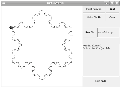
Modify your solution to Exercise 2 by adding an Entry widget and a second button. When the user presses the second button, it should read a color name from the Entry and use it to change the fill color of the circle. Use config to modify the existing circle; don’t create a new one. Your program should handle the case where the user tries to change the color of a circle that hasn’t been created, and the case where the color name is invalid. You can see my solution at http://thinkpython.com/code/circle_demo.py. 19.6 Packing widgetsSo far we have been stacking widgets in a single column, but in most GUIs the layout is more complicated. For example, Figure 19.1 shows a simplified version of TurtleWorld (see Chapter 4).
This section presents the code that creates this GUI, broken into a series of steps. You can download the complete example from http://thinkpython.com/code/SimpleTurtleWorld.py. At the top level, this GUI contains two widgets—a Canvas and a Frame—arranged in a row. So the first step is to create the row. class SimpleTurtleWorld(TurtleWorld):
"""This class is identical to TurtleWorld, but the code that
lays out the GUI is simplified for explanatory purposes."""
def setup(self):
self.row()
...
setup is the function that creates and arranges the widgets. Arranging widgets in a GUI is called packing. row creates a row Frame and makes it the “current Frame.” Until this Frame is closed or another Frame is created, all subsequent widgets are packed in a row. Here is the code that creates the Canvas and the column Frame that hold the other widgets: self.canvas = self.ca(width=400, height=400, bg='white')
self.col()
The first widget in the column is a grid Frame, which contains four buttons arranged two-by-two: self.gr(cols=2)
self.bu(text='Print canvas', command=self.canvas.dump)
self.bu(text='Quit', command=self.quit)
self.bu(text='Make Turtle', command=self.make_turtle)
self.bu(text='Clear', command=self.clear)
self.endgr()
gr creates the grid; the argument is the number of columns. Widgets in the grid are laid out left-to-right, top-to-bottom. The first button uses self.canvas.dump as a callback; the second uses self.quit. These are bound methods, which means they are associated with a particular object. When they are invoked, they are invoked on the object. The next widget in the column is a row Frame that contains a Button and an Entry: self.row([0,1], pady=30)
self.bu(text='Run file', command=self.run_file)
self.en_file = self.en(text='snowflake.py', width=5)
self.endrow()
The first argument to row is a list of weights that determines how extra space is allocated between widgets. The list [0,1] means that all extra space is allocated to the second widget, which is the Entry. If you run this code and resize the window, you will see that the Entry grows and the Button doesn’t. The option pady “pads” this row in the y direction, adding 30 pixels of space above and below. endrow ends this row of widgets, so subsequent widgets are packed in the column Frame. Gui.py keeps a stack of Frames:
The method def run_file(self):
filename = self.en_file.get()
fp = open(filename)
source = fp.read()
self.inter.run_code(source, filename)
The last two widgets are a Text widget and a Button: self.te_code = self.te(width=25, height=10)
self.te_code.insert(END, 'world.clear()\n')
self.te_code.insert(END, 'bob = Turtle(world)\n')
self.bu(text='Run code', command=self.run_text)
    def run_text(self):
        source = self.te_code.get(1.0, END)
        self.inter.run_code(source, '<user-provided code>')
Unfortunately, the details of widget layout are different in other languages, and in different Python modules. Tkinter alone provides three different mechanisms for arranging widgets. These mechanisms are called geometry managers. The one I demonstrated in this section is the “grid” geometry manager; the others are called “pack” and “place”. Fortunately, most of the concepts in this section apply to other GUI modules and other languages. 19.7 Menus and CallablesA Menubutton is a widget that looks like a button, but when pressed it pops up a menu. After the user selects an item, the menu disappears. Here is code that creates a color selection Menubutton (you can download it from http://thinkpython.com/code/menubutton_demo.py): g = Gui()
g.la('Select a color:')
colors = ['red', 'green', 'blue']
mb = g.mb(text=colors[0])
mb creates the Menubutton. Initially, the text on the button is the name of the default color. The following loop creates one menu item for each color: for color in colors:
g.mi(mb, text=color, command=Callable(set_color, color))
The first argument of mi is the Menubutton these items are associated with. The command option is a Callable object, which is something new.
So far we have seen functions and bound methods used as callbacks,
which works fine if you don’t have to pass any arguments to
the function. Otherwise you have to construct a Callable object
that contains a function, like The Callable object stores a reference to the function and the arguments as attributes. Later, when the user clicks on a menu item, the callback calls the function and passes the stored arguments. Here is what def set_color(color):
mb.config(text=color)
print color
When the user selects a menu item and 19.8 BindingA binding is an association between a widget, an event and a callback: when an event (like a button press) happens on a widget, the callback is invoked. Many widgets have default bindings. For example, when you press a button, the default binding changes the relief of the button to make it look depressed. When you release the button, the binding restores the appearance of the button and invokes the callback specified with the command option. You can use the bind method to override these default bindings or to add new ones. For example, this code creates a binding for a canvas (you can download the code in this section from http://thinkpython.com/code/draggable_demo.py): ca.bind('<ButtonPress-1>', make_circle)
The first argument is an event string; this event is triggered when the user presses the left mouse button. Other mouse events include ButtonMotion, ButtonRelease and Double-Button. The second argument is an event handler. An event handler is a function or bound method, like a callback, but an important difference is that an event handler takes an Event object as a parameter. Here is an example: def make_circle(event):
pos = ca.canvas_coords([event.x, event.y])
item = ca.circle(pos, 5, fill='red')
The Event object contains information about the type of event and
details like the coordinates of the mouse pointer. In this example
the information we need is
the location of the mouse click. These
values are in “pixel coordinates,” which are defined by the
underlying graphical system. The method For Entry widgets, it is common to bind the bu = g.bu('Make text item:', make_text)
en = g.en()
en.bind('<Return>', make_text)
def make_text(event=None):
    text = en.get()
    item = ca.text([0,0], text)
It is also possible to create bindings for Canvas items. The following is a class definition for Draggable, which is a child class of Item that provides bindings that implement drag-and-drop capability. class Draggable(Item):
def __init__(self, item):
self.canvas = item.canvas
self.tag = item.tag
self.bind('<Button-3>', self.select)
self.bind('<B3-Motion>', self.drag)
self.bind('<Release-3>', self.drop)
The init method takes an Item as a parameter. It copies the attributes of the Item and then creates bindings for three events: a button press, button motion, and button release. The event handler select stores the coordinates of the current event and the original color of the item, then changes the color to yellow: def select(self, event):
self.dragx = event.x
self.dragy = event.y
self.fill = self.cget('fill')
self.config(fill='yellow')
cget stands for “get configuration;” it takes the name of an option as a string and returns the current value of that option. drag computes how far the object has moved relative to the starting place, updates the stored coordinates, and then moves the item. def drag(self, event):
dx = event.x - self.dragx
dy = event.y - self.dragy
self.dragx = event.x
self.dragy = event.y
self.move(dx, dy)
This computation is done in pixel coordinates; there is no need to convert to Canvas coordinates. Finally, drop restores the original color of the item: def drop(self, event):
self.config(fill=self.fill)
You can use the Draggable class to add drag-and-drop
capability to an existing item. For example, here is a modified
version of def make_circle(event):
pos = ca.canvas_coords([event.x, event.y])
item = ca.circle(pos, 5, fill='red')
item = Draggable(item)
This example demonstrates one of the benefits of inheritance: you can modify the capabilities of a parent class without modifying its definition. This is particularly useful if you want to change behavior defined in a module you did not write. 19.9 DebuggingOne of the challenges of GUI programming is keeping track of which things happen while the GUI is being built and which things happen later in response to user events. For example, when you are setting up a callback, it is a common error to call the function rather than passing a reference to it: def the_callback():
print 'Called.'
g.bu(text='This is wrong!', command=the_callback())
If you run this code, you will see that it calls Another challenge of GUI programming is that you don’t have control of the flow of execution. Which parts of the program execute and their order are determined by user actions. That means that you have to design your program to work correctly for any possible sequence of events. For example, the GUI in Exercise 3 has two widgets: one creates a Circle item and the other changes the color of the Circle. If the user creates the circle and then changes its color, there’s no problem. But what if the user changes the color of a circle that doesn’t exist yet? Or creates more than one circle? As the number of widgets grows, it is increasingly difficult to imagine all possible sequences of events. One way to manage this complexity is to encapsulate the state of the system in an object and then consider:
You might also find it useful to define, and check, invariants that should hold regardless of the sequence of events. This approach to GUI programming can help you write correct code without taking the time to test every possible sequence of user events! 19.10 Glossary
19.11 ExercisesExercise 4
For this exercise, you will write an image viewer. Here is a simple example: g = Gui() canvas = g.ca(width=300) photo = PhotoImage(file='danger.gif') canvas.image([0,0], image=photo) g.mainloop() PhotoImage reads a file and returns a PhotoImage object that Tkinter can display. Canvas.image puts the image on the canvas, centered on the given coordinates. You can also put images on labels, buttons, and some other widgets: g.la(image=photo) g.bu(image=photo) PhotoImage can only handle a few image formats, like GIF and PPM, but we can use the Python Imaging Library (PIL) to read other files. The name of the PIL module is Image, but Tkinter defines an object with the same name. To avoid the conflict, you can use import...as like this: import Image as PIL import ImageTk The first line imports Image and gives it the local name PIL. The second line imports ImageTk, which can translate a PIL image into a Tkinter PhotoImage. Here’s an example: image = PIL.open('allen.png')
photo2 = ImageTk.PhotoImage(image)
g.la(image=photo2)
Solution: http://thinkpython.com/code/ImageBrowser.py. Exercise 5
A vector graphics editor is a program that allows users to draw and edit shapes on the screen and generate output files in vector graphics formats like Postscript and SVG. Write a simple vector graphics editor using Tkinter. At a minimum, it should allow users to draw lines, circles and rectangles, and it should use Canvas.dump to generate a Postscript description of the contents of the Canvas. As a challenge, you could allow users to select and resize items on the Canvas. Exercise 6 Use Tkinter to write a basic web browser. It should have a Text widget where the user can enter a URL and a Canvas to display the contents of the page. You can use the urllib module to download files (see Exercise 6) and the HTMLParser module to parse the HTML tags (see http://docs.python.org/2/library/htmlparser.html). At a minimum your browser should handle plain text and hyperlinks. As a challenge you could handle background colors, text formatting tags and images. |
ContributeIf you would like to make a contribution to support my books, you can use the button below. Thank you!
Are you using one of our books in a class?We'd like to know about it. Please consider filling out this short survey.
|


