


This HTML version of "Think Stats 2e" is provided for convenience, but it is not the best format for the book. In particular, some of the math symbols are not rendered correctly.
You might prefer to read the PDF version, or you can buy a hard copy from Amazon.
Chapter 3 Probability mass functions
The code for this chapter is in probability.py.
For information about downloading and
working with this code, see Section ??.
3.1 Pmfs
Another way to represent a distribution is a probability mass
function (PMF), which maps from each value to its probability. A
probability is a frequency expressed as a fraction of the sample
size, n. To get from frequencies to probabilities, we divide
through by n, which is called normalization.
Given a Hist, we can make a dictionary that maps from each value to its probability:
n = hist.Total()
d = {}
for x, freq in hist.Items():
    d[x] = freq / n
Or we can use the Pmf class provided by thinkstats2.
Like Hist, the Pmf constructor can take a list, pandas
Series, dictionary, Hist, or another Pmf object. Here’s an example
with a simple list:
>>> import thinkstats2
>>> pmf = thinkstats2.Pmf([1, 2, 2, 3, 5])
>>> pmf
Pmf({1: 0.2, 2: 0.4, 3: 0.2, 5: 0.2})
The Pmf is normalized so total probability is 1.
Pmf and Hist objects are similar in many ways; in fact, they inherit
many of their methods from a common parent class. For example, the
methods Values and Items work the same way for both. The
biggest difference is that a Hist maps from values to integer
counters; a Pmf maps from values to floating-point probabilities.
To look up the probability associated with a value, use Prob:
>>> pmf.Prob(2)
0.4
The bracket operator is equivalent:
>>> pmf[2]
0.4
You can modify an existing Pmf by incrementing the probability associated with a value:
>>> pmf.Incr(2, 0.2)
>>> pmf.Prob(2)
0.6
Or you can multiply a probability by a factor:
>>> pmf.Mult(2, 0.5)
>>> pmf.Prob(2)
0.3
If you modify a Pmf, the result may not be normalized; that is, the
probabilities may no longer add up to 1. To check, you can call Total,
which returns the sum of the probabilities:
>>> pmf.Total()
0.9
To renormalize, call Normalize:
>>> pmf.Normalize()
>>> pmf.Total()
1.0
Pmf objects provide a Copy method so you can make
and modify a copy without affecting the original.
My notation in this section might seem inconsistent, but there is a
system: I use Pmf for the name of the class, pmf for an instance
of the class, and PMF for the mathematical concept of a
probability mass function.
3.2 Plotting PMFs
thinkplot provides two ways to plot Pmfs:
- To plot a Pmf as a bar graph, you can use
thinkplot.Hist. Bar graphs are most useful if the number of values in the Pmf is small. - To plot a Pmf as a step function, you can use
thinkplot.Pmf. This option is most useful if there are a large number of values and the Pmf is smooth. This function also works with Hist objects.
In addition, pyplot provides a function called hist that
takes a sequence of values, computes a histogram, and plots it.
Since I use Hist objects, I usually don’t use pyplot.hist.
Figure 3.1: PMF of pregnancy lengths for first babies and others, using bar graphs and step functions.

Figure ?? shows PMFs of pregnancy length for first babies and others using bar graphs (left) and step functions (right).
By plotting the PMF instead of the histogram, we can compare the two distributions without being mislead by the difference in sample size. Based on this figure, first babies seem to be less likely than others to arrive on time (week 39) and more likely to be a late (weeks 41 and 42).
Here’s the code that generates Figure ??:
    thinkplot.PrePlot(2, cols=2)
    thinkplot.Hist(first_pmf, align='right', width=width)
    thinkplot.Hist(other_pmf, align='left', width=width)
    thinkplot.Config(xlabel='weeks',
                     ylabel='probability',
                     axis=[27, 46, 0, 0.6])

    thinkplot.PrePlot(2)
    thinkplot.SubPlot(2)
    thinkplot.Pmfs([first_pmf, other_pmf])
    thinkplot.Show(xlabel='weeks',
                   axis=[27, 46, 0, 0.6])
PrePlot takes optional parameters rows and cols
to make a grid of figures, in this case one row of two figures.
The first figure (on the left) displays the Pmfs using thinkplot.Hist,
as we have seen before.
The second call to PrePlot resets the color generator. Then
SubPlot switches to the second figure (on the right) and
displays the Pmfs using thinkplot.Pmfs. I used the axis option
to ensure that the two figures are on the same axes, which is
generally a good idea if you intend to compare two figures.
3.3 Other visualizations
Histograms and PMFs are useful while you are exploring data and trying to identify patterns and relationships. Once you have an idea what is going on, a good next step is to design a visualization that makes the patterns you have identified as clear as possible.
In the NSFG data, the biggest differences in the distributions are near the mode. So it makes sense to zoom in on that part of the graph, and to transform the data to emphasize differences:
    weeks = range(35, 46)
    diffs = []
    for week in weeks:
        p1 = first_pmf.Prob(week)
        p2 = other_pmf.Prob(week)
        diff = 100 * (p1 - p2)
        diffs.append(diff)

    thinkplot.Bar(weeks, diffs)
In this code, weeks is the range of weeks; diffs is the
difference between the two PMFs in percentage points.
Figure ?? shows the result as a bar chart.
This figure makes the pattern clearer: first babies are less likely to
be born in week 39, and somewhat more likely to be born in weeks 41
and 42.
Figure 3.2: Difference, in percentage points, by week.

For now we should hold this conclusion only tentatively. We used the same dataset to identify an apparent difference and then chose a visualization that makes the difference apparent. We can’t be sure this effect is real; it might be due to random variation. We’ll address this concern later.
3.4 The class size paradox
Before we go on, I want to demonstrate one kind of computation you can do with Pmf objects; I call this example the “class size paradox.”
At many American colleges and universities, the student-to-faculty ratio is about 10:1. But students are often surprised to discover that their average class size is bigger than 10. There are two reasons for the discrepancy:
- Students typically take 4–5 classes per semester, but professors often teach 1 or 2.
- The number of students who enjoy a small class is small, but the number of students in a large class is (ahem!) large.
The first effect is obvious, at least once it is pointed out; the second is more subtle. Let’s look at an example. Suppose that a college offers 65 classes in a given semester, with the following distribution of sizes:
 size      count
 5- 9          8
10-14          8
15-19         14
20-24          4
25-29          6
30-34         12
35-39          8
40-44          3
45-49          2
If you ask the Dean for the average class size, he would construct a PMF, compute the mean, and report that the average class size is 23.7. Here’s the code:
    d = { 7: 8, 12: 8, 17: 14, 22: 4,
          27: 6, 32: 12, 37: 8, 42: 3, 47: 2 }

    pmf = thinkstats2.Pmf(d, label='actual')
    print('mean', pmf.Mean())
But if you survey a group of students, ask them how many students are in their classes, and compute the mean, you would think the average class was bigger. Let’s see how much bigger.
First, I compute the distribution as observed by students, where the probability associated with each class size is “biased” by the number of students in the class.
def BiasPmf(pmf, label):
    new_pmf = pmf.Copy(label=label)

    for x, p in pmf.Items():
        new_pmf.Mult(x, x)

    new_pmf.Normalize()
    return new_pmf
For each class size, x, we multiply the probability by
x, the number of students who observe that class size.
The result is a new Pmf that represents the biased distribution.
Now we can plot the actual and observed distributions:
    biased_pmf = BiasPmf(pmf, label='observed')
    thinkplot.PrePlot(2)
    thinkplot.Pmfs([pmf, biased_pmf])
    thinkplot.Show(xlabel='class size', ylabel='PMF')
Figure 3.3: Distribution of class sizes, actual and as observed by students.
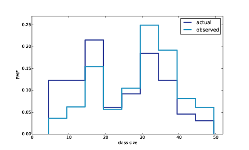
Figure ?? shows the result. In the biased distribution there are fewer small classes and more large ones. The mean of the biased distribution is 29.1, almost 25% higher than the actual mean.
It is also possible to invert this operation. Suppose you want to find the distribution of class sizes at a college, but you can’t get reliable data from the Dean. An alternative is to choose a random sample of students and ask how many students are in their classes.
The result would be biased for the reasons we’ve just seen, but you can use it to estimate the actual distribution. Here’s the function that unbiases a Pmf:
def UnbiasPmf(pmf, label):
    new_pmf = pmf.Copy(label=label)

    for x, p in pmf.Items():
        new_pmf.Mult(x, 1.0/x)

    new_pmf.Normalize()
    return new_pmf
It’s similar to BiasPmf; the only difference is that it
divides each probability by x instead of multiplying.
3.5 DataFrame indexing
In Section ?? we read a pandas DataFrame and used it to select and modify data columns. Now let’s look at row selection. To start, I create a NumPy array of random numbers and use it to initialize a DataFrame:
>>> import numpy as np
>>> import pandas
>>> array = np.random.randn(4, 2)
>>> df = pandas.DataFrame(array)
>>> df
          0         1
0 -0.143510  0.616050
1 -1.489647  0.300774
2 -0.074350  0.039621
3 -1.369968  0.545897
By default, the rows and columns are numbered starting at zero, but you can provide column names:
>>> columns = ['A', 'B']
>>> df = pandas.DataFrame(array, columns=columns)
>>> df
          A         B
0 -0.143510  0.616050
1 -1.489647  0.300774
2 -0.074350  0.039621
3 -1.369968  0.545897
You can also provide row names. The set of row names is called the index; the row names themselves are called labels.
>>> index = ['a', 'b', 'c', 'd']
>>> df = pandas.DataFrame(array, columns=columns, index=index)
>>> df
          A         B
a -0.143510  0.616050
b -1.489647  0.300774
c -0.074350  0.039621
d -1.369968  0.545897
As we saw in the previous chapter, simple indexing selects a column, returning a Series:
>>> df['A']
a   -0.143510
b   -1.489647
c   -0.074350
d   -1.369968
Name: A, dtype: float64
To select a row by label, you can use the loc attribute, which
returns a Series:
>>> df.loc['a']
A   -0.14351
B    0.61605
Name: a, dtype: float64
If you know the integer position of a row, rather than its label, you
can use the iloc attribute, which also returns a Series.
>>> df.iloc[0]
A   -0.14351
B    0.61605
Name: a, dtype: float64
loc can also take a list of labels; in that case,
the result is a DataFrame.
>>> indices = ['a', 'c']
>>> df.loc[indices]
         A         B
a -0.14351  0.616050
c -0.07435  0.039621
Finally, you can use a slice to select a range of rows by label:
>>> df['a':'c']
          A         B
a -0.143510  0.616050
b -1.489647  0.300774
c -0.074350  0.039621
Or by integer position:
>>> df[0:2]
          A         B
a -0.143510  0.616050
b -1.489647  0.300774
The result in either case is a DataFrame, but notice that the first result includes the end of the slice; the second doesn’t.
My advice: if your rows have labels that are not simple integers, use the labels consistently and avoid using integer positions.
3.6 Exercises
Solutions to these exercises are in chap03soln.ipynb
and chap03soln.py
Use the NSFG respondent variable NUMKDHH to construct the actual
distribution for the number of children under 18 in the household.
Now compute the biased distribution we would see if we surveyed the children and asked them how many children under 18 (including themselves) are in their household.
Plot the actual and biased distributions, and compute their means.
As a starting place, you can use chap03ex.ipynb.
In Section ?? we computed the mean of a sample by adding up the elements and dividing by n. If you are given a PMF, you can still compute the mean, but the process is slightly different:
| x = |
| pi xi |
where the xi are the unique values in the PMF and pi=PMF(xi). Similarly, you can compute variance like this:
| S2 = |
| pi (xi − x)2 |
Write functions called PmfMean and PmfVar that take a
Pmf object and compute the mean and variance. To test these methods,
check that they are consistent with the methods Mean and Var
provided by Pmf.
To address this version of the question, select respondents who have at least two babies and compute pairwise differences. Does this formulation of the question yield a different result?
Hint: use nsfg.MakePregMap.
In most foot races, everyone starts at the same time. If you are a fast runner, you usually pass a lot of people at the beginning of the race, but after a few miles everyone around you is going at the same speed.
When I ran a long-distance (209 miles) relay race for the first time, I noticed an odd phenomenon: when I overtook another runner, I was usually much faster, and when another runner overtook me, he was usually much faster.
At first I thought that the distribution of speeds might be bimodal; that is, there were many slow runners and many fast runners, but few at my speed.
Then I realized that I was the victim of a bias similar to the effect of class size. The race was unusual in two ways: it used a staggered start, so teams started at different times; also, many teams included runners at different levels of ability.
As a result, runners were spread out along the course with little relationship between speed and location. When I joined the race, the runners near me were (pretty much) a random sample of the runners in the race.
So where does the bias come from? During my time on the course, the chance of overtaking a runner, or being overtaken, is proportional to the difference in our speeds. I am more likely to catch a slow runner, and more likely to be caught by a fast runner. But runners at the same speed are unlikely to see each other.
Write a function called ObservedPmf that takes a Pmf representing
the actual distribution of runners’ speeds, and the speed of a running
observer, and returns a new Pmf representing the distribution of
runners’ speeds as seen by the observer.
To test your function, you can use relay.py, which reads the
results from the James Joyce Ramble 10K in Dedham MA and converts the
pace of each runner to mph.
Compute the distribution of speeds you would observe if you ran a
relay race at 7.5 mph with this group of runners. A solution to this
exercise is in relay_soln.py.
3.7 Glossary
- Probability mass function (PMF): a representation of a distribution as a function that maps from values to probabilities.
- probability: A frequency expressed as a fraction of the sample size.
- normalization: The process of dividing a frequency by a sample size to get a probability.
- index: In a pandas DataFrame, the index is a special column that contains the row labels.


