Chapter 5 Scale-free networks5.1 Zipf’s LawZipf’s law describes a relationship between the frequencies and ranks of words in natural languages; see http://en.wikipedia.org/wiki/Zipf's_law. The “frequency” of a word is the number of times it appears in a body of work. The “rank” of a word is its position in a list of words sorted by frequency: the most common word has rank 1, the second most common has rank 2, etc. Specifically, Zipf’s Law predicts that the frequency, f, of the word with rank r is:
where s and c are parameters that depend on the language and the text. If you take the logarithm of both sides of this equation, you get:
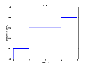
So if you plot logf versus logr, you should get a straight line with slope −s and intercept logc. Exercise 1 Write a program that reads a text from a file, counts word frequencies, and prints one line for each word, in descending order of frequency. You can test it by downloading an out-of-copyright book in plain text format from gutenberg.net. You might want to remove punctuation from the words. If you need some help getting started, you can download thinkcomplex.com/Pmf.py, which provides an object named Hist that maps from value to frequencies. Plot the results and check whether they form a straight line. For plotting suggestions, see Section 3.6. Can you estimate the value of s? You can download my solution from thinkcomplex.com/Zipf.py 5.2 Cumulative distributionsA distribution is a statistical description of a set of values. For example, if you collect the population of every city and town in the U.S., you would have a set of about 14,000 integers. The simplest description of this set is a list of numbers, which would be complete but not very informative. A more concise description is a statistical summary like the mean and variation, but that is not a complete description because there are many sets of values with the same summary statistics. One alternative is a histogram, which divides the range of possible values into “bins” and counts the number of values that fall in each bin. Histograms are common, so they are easy to understand, but it is tricky to get the bin size right. If the bins are too small, the number of values in each bin is also small, so the histogram doesn’t give much insight. If the bins are too large, they lump together a wide range of values, which obscures details that might be important. A better alternative is a cumulative distribution function (CDF), which maps from a value, x, to the fraction of values less than or equal to x. If you choose a value at random, CDF(x) is the probability that the value you get is less than or equal to x. For a list of n values, the simplest way to compute CDF is to sort the values. Then the CDF of the ith value (starting from 1) is i/n. I have written a class called Cdf that provides functions for creating and manipulating CDFs. You can download it from thinkcomplex.com/Cdf.py. As an example, we’ll compute the CDF for the values {1,2,2,4,5}: import Cdf cdf = Cdf.MakeCdfFromList([1,2,2,4,5]) MakeCdfFromList can take any sequence or iterator. Once you have the Cdf, you can find the probability, CDF(x), for a given value: prob = cdf.Prob(2) The result is 0.6, because 3/5 of the values are less than or equal to 2. You can also compute the value for a given probability: value = cdf.Value(0.5) The value with probability 0.5 is the median, which in this example is 2. To plot the Cdf, you can use Render, which returns a list of value-probability pairs. xs, ps = cdf.Render()
for x, p in zip(xs, ps):
print x, p
The result is: 1 0.0 1 0.2 2 0.2 2 0.6 4 0.6 4 0.8 5 0.8 5 1.0 Each value appears twice. That way when we plot the CDF, we get a stair-step pattern. import matplotlib.pyplot as pyplot
xs, ps = cdf.Render()
pyplot.plot(xs, ps, linewidth=3)
pyplot.axis([0.9, 5.1, 0, 1])
pyplot.title('CDF')
pyplot.xlabel('value, x')
pyplot.ylabel('probability, CDF(x)')
pyplot.show()
Figure 5.1 shows the cumulative distribution function (CDF), for the values (1,2,2,4,5). I drew vertical lines at each of the values, which is not mathematically correct. To be more rigorous, I should draw a discontinuous function. Exercise 2 Read the code in Cdf.py. What is the order of growth for MakeCdfFromList and the methods Prob and Value? 5.3 Continuous distributionsThe distributions we have seen so far are sometimes called empirical distributions because they are based on a dataset that comes from some kind of empirical observation. An alternative is a continuous distribution, which is characterized by a CDF that is a continuous function. Some of these distributions, like the Gaussian or normal distribution, are well known, at least to people who have studied statistics. Many real world phenomena can be approximated by continuous distributions, which is why they are useful. For example, if you observe a mass of radioactive material with an instrument that can detect decay events, the distribution of times between events will most likely fit an exponential distribution. The same is true for any series where an event is equally likely at any time. The CDF of the exponential distribution is:
The parameter, λ, determines the mean and variance of the distribution. This equation can be used to derive a simple visual test for whether a dataset can be well approximated by an exponential distribution. All you have to do is plot the complementary distribution on a log-y scale. The complementary distribution (CCDF) is just 1 − CDF(x); if you plot the complementary distribution of a dataset that you think is exponential, you expect to see a function like:
If you take the log of both sides of this equation, you get:
So on a log-y scale the CCDF should look like a straight line with slope −λ. Exercise 3 Write a function called To test your function, use expovariate from the random module to generate 100 values from an exponential distribution. Plot the CCDF on a log-y scale and see if it falls on a straight line. 5.4 Pareto distributionsThe Pareto distribution is named after the economist Vilfredo Pareto, who used it to describe the distribution of wealth; see http://en.wikipedia.org/wiki/Pareto_distribution. Since then, people have used it to describe phenomena in the natural and social sciences including sizes of cities and towns, sand particles and meteorites, forest fires and earthquakes. The Pareto distribution is characterized by a CDF with the following form:
The parameters xm and α determine the location and shape of the distribution. xm is the minimum possible quantity. Values from a Pareto distribution often have these properties:
To get a sense of the difference between the Pareto and Gaussian distributions, imagine what the world would be like if the distribution of human height were Pareto. In Pareto World, the shortest person is 100 cm, and the median is 150 cm, so that part of the distribution is not very different from ours. But if you generate 6 billion values from this distribution distribution, the tallest person might be 100 km—that’s what it means to be scale-free! There is a simple visual test that indicates whether an empirical distribution is well-characterized by a Pareto distribution: on a log-log scale, the CCDF looks like a straight line. The derivation is similar to what we saw in the previous section. The equation for the CCDF is:
Taking the log of both sides yields:
So if you plot logy versus logx, it should look like a straight line with slope −α and intercept α logxm. Exercise 4 Write a version of To test your function, use paretovariate from the random module to generate 100 values from a Pareto distribution. Plot the CCDF on a log-y scale and see if it falls on a straight line. What happens to the curve as you increase the number of values? Exercise 5 The distribution of populations for cities and towns has been proposed as an example of a real-world phenomenon that can be described with a Pareto distribution. The U.S. Census Bureau publishes data on the population of every incorporated city and town in the United States. I wrote a small program that downloads this data and converts it into a convenient form. You can download it from thinkcomplex.com/populations.py. Read over the program to make sure you know what it does and then write a program that computes and plots the distribution of populations for the 14593 cities and towns in the dataset. Plot the CDF on linear and log-x scales so you can get a sense of the shape of the distribution. Then plot the CCDF on a log-log scale to see if it has the characteristic shape of a Pareto distribution. What conclusion do you draw about the distribution of sizes for cities and towns? 5.5 Barabási and AlbertIn 1999 Barabási and Albert published a paper in Science, “Emergence of Scaling in Random Networks,” that characterizes the structure (also called “topology”) of several real-world networks, including graphs that represent the interconnectivity of movie actors, world-wide web (WWW) pages, and elements in the electrical power grid in the western United States. You can download the paper from http://www.sciencemag.org/content/286/5439/509. They measure the degree (number of connections) of each node and compute P(k), the probability that a vertex has degree k; then they plot P(k) versus k on a log-log scale. The tail of the plot fits a straight line, so they conclude that it obeys a power law; that is, as k gets large, P(k) is asymptotic to k− γ, where γ is a parameter that determines the rate of decay. They also propose a model that generates random graphs with the same property. The essential features of the model, which distinguish it from the Erdős-Rényi model and the Watts-Strogatz model, are:
Finally, they show that graphs generated by this model have a distribution of degrees that obeys a power law. Graphs that have this property are sometimes called scale-free networks; see http://en.wikipedia.org/wiki/Scale-free_network. That name can be confusing because it is the distribution of degrees that is scale-free, not the network. In order to maximize confusion, distributions that obey the power law are sometimes called scaling distributions because they are invariant under a change of scale. That means that if you change the units the quantities are expressed in, the slope parameter, γ, doesn’t change. You can read http://en.wikipedia.org/wiki/Power_law for the details, but it is not important for what we are doing here. Exercise 6 This exercise asks you to make connections between the Watts-Strogatz (WS) and Barabási-Albert (BA) models:
5.6 Zipf, Pareto and power lawsAt this point we have seen three phenomena that yield a straight line on a log-log plot:
The similarity in these plots is not a coincidence; these visual tests are closely related. Starting with a power-law distribution, we have:
If we choose a random node in a scale free network, P(k) is the probability that its degree equals k. The cumulative distribution function, CDF(k), is the probability that the degree is less than or equal to k, so we can get that by summation:
For large values of k we can approximate the summation with an integral:
To make this a proper CDF we could normalize it so that it goes to 1 as k goes to infinity, but that’s not necessary, because all we need to know is:
Which shows that the distribution of k is asymptotic to a Pareto distribution with α = γ − 1. Similarly, if we start with a straight line on a Zipf plot, we have1:
Where f is the frequency of the word with rank r. Inverting this relationship yields:
Now subtracting 1 and dividing through by the number of different words, n, we get
Which is only interesting because if r is the rank of a word, then (r−1)/n is the fraction of words with lower ranks, which is the fraction of words with higher frequency, which is the CCDF of the distribution of frequencies:
To characterize the asymptotic behavior for large n we can ignore c and 1/n, which yields:
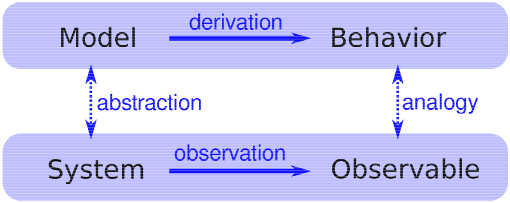
Which shows that if a set of words obeys Zipf’s law, the distribution of their frequencies is asymptotic to a Pareto distribution with α = 1/s. So the three visual tests are mathematically equivalent; a dataset that passes one test will pass all three. But as a practical matter, the power law plot is noisier than the other two, because it is the derivative of the CCDF. The Zipf and CCDF plots are more robust, but Zipf’s law is only applicable to discrete data (like words), not continuous quantities. CCDF plots work with both. For these reasons—robustness and generality—I recommend using CCDFs. Exercise 7 The Stanford Large Network Dataset Collection is a repository of datasets from a variety of networks, including social networks, communication and collaboration, Internet and road networks. See http://snap.stanford.edu/data/index.html. Download one of these datasets and explore. Is there evidence of small-world behavior? Is the network scale-free? What else can you discover? 5.7 Explanatory modelsWe started the discussion of networks with Milgram’s Small World Experiment, which shows that path lengths in social networks are surprisingly small; hence, “six degrees of separation”. When we see something surprising, it is natural to ask “Why?” but sometimes it’s not clear what kind of answer we are looking for. One kind of answer is an explanatory model (see Figure 5.2). The logical structure of an explanatory model is:
At its core, this is an argument by analogy, which says that if two things are similar in some ways, they are likely to be similar in other ways. Argument by analogy can be useful, and explanatory models can be satisfying, but they do not constitute a proof in the mathematical sense of the word. Remember that all models leave out, or “abstract away” details that we think are unimportant. For any system there are many possible models that include or ignore different features. And there might be models that exhibit different behaviors, B, B’ and B”, that are similar to O in different ways. In that case, which model explains O? The small world phenomenon is an example: the Watts-Strogatz (WS) model and the Barabási-Albert (BA) model both exhibit small world behavior, but they offer different explanations:
As is often the case in young areas of science, the problem is not that we have no explanations, but too many. Exercise 8 Are these explanations compatible; that is, can they both be right? Which do you find more satisfying as an explanation, and why? Is there data you could collect, or experiments you could perform, that would provide evidence in favor of one model over the other? Choosing among competing models is the topic of Thomas Kuhn’s essay, “Objectivity, Value Judgment, and Theory Choice.” Kuhn was a historian of science who wrote The Structure of Scientific Revolutions in 1962, and spent the rest of his life explaining what he meant to say. What criteria does Kuhn propose for choosing among competing models? Do these criteria influence your opinion about the WS and BA models? Are there other criteria you think should be considered?
|
Like this book?
Are you using one of our books in a class?We'd like to know about it. Please consider filling out this short survey.
|