|
This HTML version of Think Complexity, 2nd Edition is provided for convenience, but it is not the best format of the book. In particular, some of the symbols are not rendered correctly. You might prefer to read the PDF version. Chapter 4 Scale-free networksIn this chapter, we’ll work with data from an online social network, and use a Watts-Strogatz graph to model it. The WS model has characteristics of a small world network, like the data, but it has low variability in the number of neighbors from node to node, unlike the data. This discrepancy is the motivation for a network model developed by Barabási and Albert. The BA model captures the observed variability in the number of neighbors, and it has one of the small world properties, short path lengths, but it does not have the high clustering of a small world network. The chapter ends with a discussion of WS and BA graphs as explanatory models for small world networks. The code for this chapter is in chap04.ipynb in the respository for this book. More information about working with the code is in Section ??. 4.1 Social network dataWatts-Strogatz graphs are intended to model networks in the natural and social sciences. In their original paper, Watts and Strogatz looked at the network of film actors (connected if they have appeared in a movie together); the electrical power grid in the western United States; and the network of neurons in the brain of the roundworm C. elegans. They found that all of these networks had the high connectivity and low path lengths characteristic of small world graphs. In this section we’ll perform the same analysis with a different dataset, a set of Facebook users and their friends. If you are not familiar with Facebook, users who are connected to each other are called “friends”, regardless of the nature of their relationship in the real world. I’ll use data from the Stanford Network Analysis Project (SNAP), which shares large datasets from online social networks and other sources. Specifically, I’ll use their Facebook data1, which includes 4039 users and 88,234 friend relationships among them. This dataset is in the repository for this book, but it is also available from the SNAP website at http://thinkcomplex.com/snap. The data file contains one line per edge, with users identified by integers from 0 to 4038. Here’s the code that reads the file:
NumPy provides a function called Then we use
The node and edge counts are consistent with the documentation of the dataset. Now we can check whether this dataset has the characteristics of a small world graph: high clustering and low path lengths. In Section ?? we wrote a function to compute
the network average clustering coefficient. NetworkX provides
a function called But for larger graphs, they are both too slow, taking time proportional to n k2, where n is the number of nodes and k is the number of neighbors each node is connected to. Fortunately, NetworkX provides a function that estimates the clustering coefficient by random sampling. You can invoke it like this:
The following function does something similar for path lengths.
The list comprehension enumerates the rows in the array and computes the shortest distance between each pair of nodes. The result is a list of path lengths.
I’ll use
And
The clustering coefficient is about 0.61, which is high, as we expect if this network has the small world property. And the average path is 3.7, which is quite short in a network of more than 4000 users. It’s a small world after all. Now let’s see if we can construct a WS graph that has the same characteristics as this network. 4.2 WS ModelIn the Facebook dataset, the average number of edges per node is about 22. Since each edge is connected to two nodes, the average degree is twice the number of edges per node:
We can make a WS graph with
In this graph, clustering is high: With
In the random graph, By trial and error, we find that when
In this graph So far, so good. 4.3 Degree
If the WS graph is a good model for the Facebook network, it should have the same average degree across nodes, and ideally the same variance in degree. This function returns a list of degrees in a graph, one for each node:
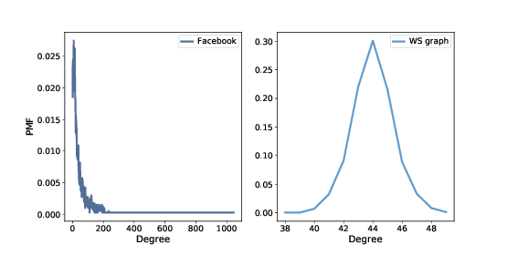
The mean degree in model is 44, which is close to the mean degree in the dataset, 43.7. However, the standard deviation of degree in the model is 1.5, which is not close to the standard deviation in the dataset, 52.4. Oops. What’s the problem? To get a better view, we have to look at the distribution of degrees, not just the mean and standard deviation. I’ll represent the distribution of degrees with a Briefly, a As an example, I’ll construct a graph with nodes 1, 2, and 3 connected to a central node, 0:
Here’s the list of degrees in this graph:
Node 0 has degree 3, the others have degree 1. Now I can make
a
The result is a Now we can make a
And the same for the WS model:
We can use the
Figure ?? shows the two distributions. They are very different. In the WS model, most users have about 44 friends; the minimum is 38 and the maximum is 50. That’s not much variation. In the dataset, there are many users with only 1 or 2 friends, but one has more than 1000! Distributions like this, with many small values and a few very large values, are called heavy-tailed. 4.4 Heavy-tailed distributions
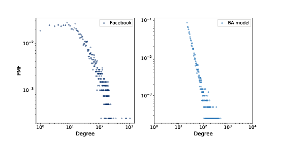
Heavy-tailed distributions are a common feature in many areas of complexity science and they will be a recurring theme of this book. We can get a clearer picture of a heavy-tailed distribution by plotting it on a log-log axis, as shown in Figure ??. This transformation emphasizes the tail of the distribution; that is, the probabilities of large values. Under this transformation, the data fall approximately on a straight line, which suggests that there is a power law relationship between the largest values in the distribution and their probabilities. Mathematically, a distribution obeys a power law if
where PMF(k) is the fraction of nodes with degree k, α is a parameter, and the symbol ∼ indicates that the PMF is asymptotic to k−α as k increases. If we take the log of both sides, we get
So if a distribution follows a power law and we plot PMF(k) versus k on a log-log scale, we expect a straight line with slope −α, at least for large values of k. All power law distributions are heavy-tailed, but there are other heavy-tailed distributions that don’t follow a power law. We will see more examples soon. But first, we have a problem: the WS model has the high clustering and low path length we see in the data, but the degree distribution doesn’t resemble the data at all. This discrepancy is the motivation for our next topic, the Barabási-Albert model. 4.5 Barabási-Albert modelIn 1999 Barabási and Albert published a paper, “Emergence of Scaling in Random Networks”, that characterizes the structure of several real-world networks, including graphs that represent the interconnectivity of movie actors, web pages, and elements in the electrical power grid in the western United States. You can download the paper from http://thinkcomplex.com/barabasi. They measure the degree of each node and compute PMF(k), the probability that a vertex has degree k. Then they plot PMF(k) versus k on a log-log scale. The plots fit a straight line, at least for large values of k, so Barabási and Albert conclude that these distributions are heavy-tailed. They also propose a model that generates graphs with the same property. The essential features of the model, which distinguish it from the WS model, are:
Finally, they show that graphs generated by the Barabási-Albert (BA) model have a degree distribution that obeys a power law. Graphs with this property are sometimes called scale-free networks, for reasons I won’t explain; if you are curious, you can read more at http://thinkcomplex.com/scale. NetworkX provides a function that generates BA graphs. We will use it first; then I’ll show you how it works.
The parameters are
The resulting graph has 4039 nodes and 21.9 edges per node. Since every edge is connected to two nodes, the average degree is 43.8, very close to the average degree in the dataset, 43.7. And the standard deviation of degree is 40.9, which is a bit less than in the dataset, 52.4, but it is much better than what we got from the WS graph, 1.5. Figure ?? shows the degree distributions for the
Facebook dataset and the BA model on a log-log scale. The model
is not perfect; in particular, it deviates from the data when
So the BA model is better than the WS model at reproducing the degree distribution. But does it have the small world property? In this example, the average path length, L, is 2.5, which is even more “small world” than the actual network, which has L=3.69. So that’s good, although maybe too good. On the other hand, the clustering coefficient, C, is 0.037, not even close to the value in the dataset, 0.61. So that’s a problem. Table ?? summarizes these results. The WS model captures the small world characteristics, but not the degree distribution. The BA model captures the degree distribution, at least approximately, and the average path length, but not the clustering coefficient. In the exercises at the end of this chapter, you can explore other models intended to capture all of these characteristics. 4.6 Generating BA graphsIn the previous sections we used a NetworkX function to generate BA
graphs; now let’s see how it works. Here is a version
of
The parameters are We start with a graph that has
Each time through the loop, we add edges from the source to
each node in Finally, we choose a subset of the nodes to be targets for the
next iteration. Here’s the definition of
Each time through the loop, 4.7 Cumulative distributions
Figure ?? represents the degree distribution by plotting the probability mass function (PMF) on a log-log scale. That’s how Barabási and Albert present their results and it is the representation used most often in articles about power law distributions. But it is not the best way to look at data like this. A better alternative is a cumulative distribution function (CDF), which maps from a value, x, to the fraction of values less than or equal to x. Given a
For example, given the degree distribution in the dataset,
The result is close to 0.5, which means that the median number of friends is about 25. CDFs are better for visualization because they are less noisy than PMFs. Once you get used to interpreting CDFs, they provide a clearer picture of the shape of a distribution than PMFs. The
And
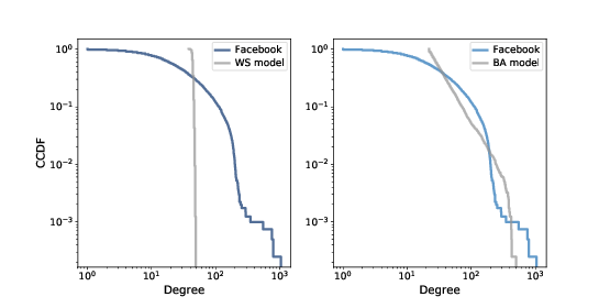
Figure ?? shows the degree CDF for the Facebook dataset along with the WS model (left) and the BA model (right). The x-axis is on a log scale.
Clearly the CDF for the WS model is very different from the CDF from the data. The BA model is better, but still not very good, especially for small values. In the tail of the distribution (values greater than 100) it looks like the BA model matches the dataset well enough, but it is hard to see. We can get a clearer view with one other view of the data: plotting the complementary CDF on a log-log scale. The complementary CDF (CCDF) is defined
This definition is useful because if the PMF follows a power law, the CCDF also follows a power law:
where xm is the minimum possible value and α is a parameter that determines the shape of the distribution. Taking the log of both sides yields:
So if the distribution obeys a power law, we expect the CCDF on a log-log scale to be a straight line with slope −α. Figure ?? shows the CCDF of degree for the Facebook data, along with the WS model (left) and the BA model (right), on a log-log scale. With this way of looking at the data, we can see that the BA model matches the tail of the distribution (values above 20) reasonably well. The WS model does not. 4.8 Explanatory modelsWe started the discussion of networks with Milgram’s Small World Experiment, which shows that path lengths in social networks are surprisingly small; hence, “six degrees of separation”. When we see something surprising, it is natural to ask “Why?” but sometimes it’s not clear what kind of answer we are looking for. One kind of answer is an explanatory model (see Figure ??). The logical structure of an explanatory model is:
At its core, this is an argument by analogy, which says that if two things are similar in some ways, they are likely to be similar in other ways. Argument by analogy can be useful, and explanatory models can be satisfying, but they do not constitute a proof in the mathematical sense of the word. Remember that all models leave out, or “abstract away”, details that we think are unimportant. For any system there are many possible models that include or ignore different features. And there might be models that exhibit different behaviors that are similar to O in different ways. In that case, which model explains O? The small world phenomenon is an example: the Watts-Strogatz (WS) model and the Barabási-Albert (BA) model both exhibit elements of small world behavior, but they offer different explanations:
As is often the case in young areas of science, the problem is not that we have no explanations, but too many. 4.9 ExercisesExercise 1 In Section ?? we discussed two explanations for the small world phenomenon, “weak ties” and “hubs”. Are these explanations compatible; that is, can they both be right? Which do you find more satisfying as an explanation, and why? Is there data you could collect, or experiments you could perform, that would provide evidence in favor of one model over the other? Choosing among competing models is the topic of Thomas Kuhn’s essay, “Objectivity, Value Judgment, and Theory Choice”, which you can read at http://thinkcomplex.com/kuhn. What criteria does Kuhn propose for choosing among competing models? Do these criteria influence your opinion about the WS and BA models? Are there other criteria you think should be considered? Exercise 2 NetworkX provides a function called Exercise 3
Data files from the Barabási and Albert paper are available from
http://thinkcomplex.com/netdata. Their actor collaboration data is included in the repository for this book in a
file named
Compute the number of actors in the graph and the average degree. Plot the PMF of degree on a log-log scale. Also plot the CDF of degree on a log-x scale, to see the general shape of the distribution, and on a log-log scale, to see whether the tail follows a power law. Note: The actor network is not connected, so you might want to use
|
Buy this book at Amazon.com
ContributeIf you would like to make a contribution to support my books, you can use the button below and pay with PayPal. Thank you!
Are you using one of our books in a class?We'd like to know about it. Please consider filling out this short survey.
|